Every website can be improved. I do these random makeovers to show the difference an expert can make. Take these tips, apply them to your own site, and turn your website into a marketing machine!
Optimum Investment Advisors
Investment Advisor Website
Search Term: Financial Advisor Chicago
Focus on: Homepage
BEFORE
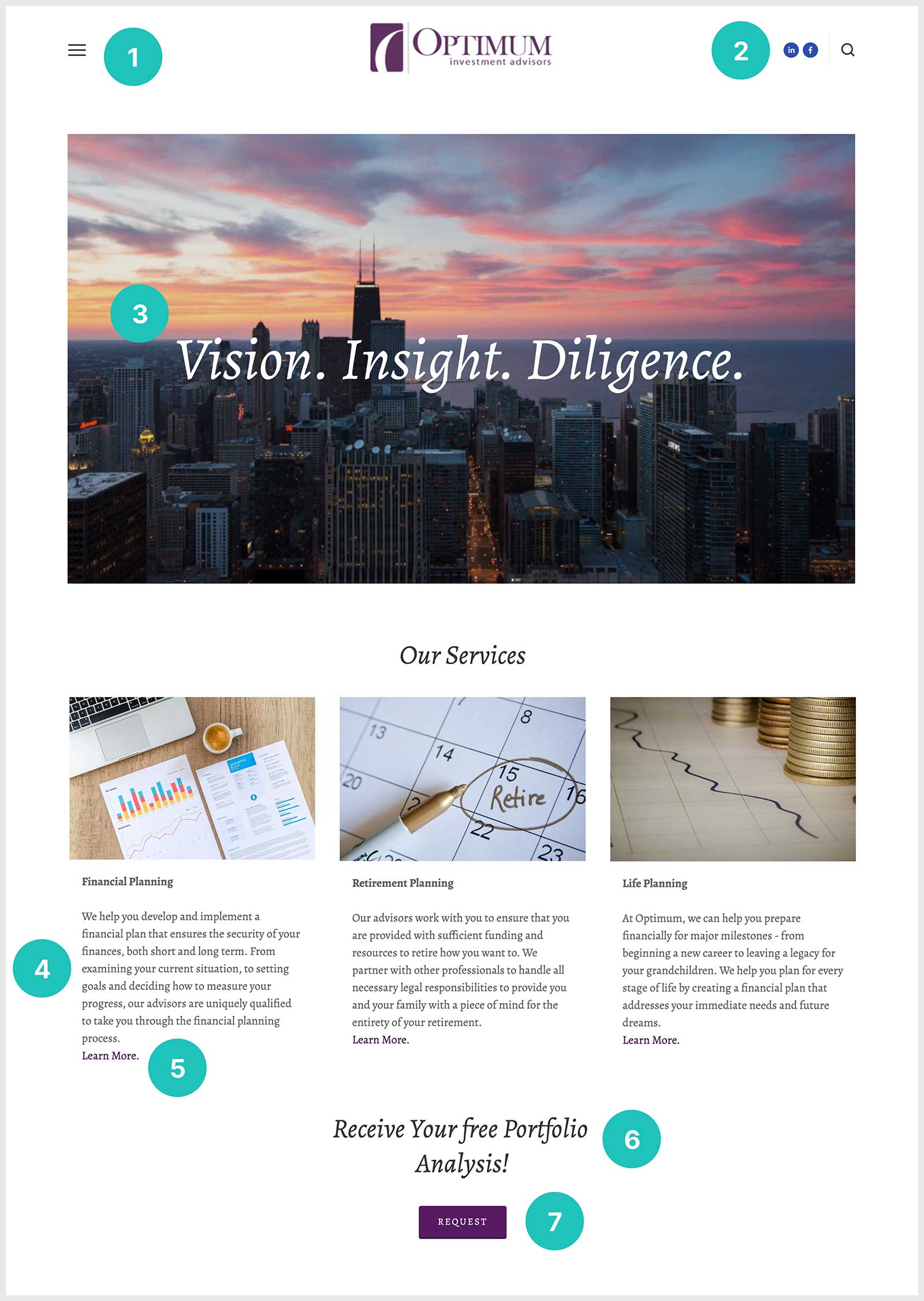
This site has some big issues: it’s not clear what they do and who they help, I’m not sure where I’m supposed to click, and the images are overtaking the message. Let’s see what we can do with some expert revisions…
Change #1
Fun fact: did you know that this is called a “hamburger menu” with the three lines representing the burger and two buns? Using a mobile menu like this might save YOU time when you’re building your site, but it will frustrate your users. On desktops, visitors like to see their options without having to open a sliding menu.
👑 TAKEAWAY: Your goal is to always make sure your website is as user-friendly as possible. Use a hamburger menu for mobile devices, but a traditional navigation menu for desktops and large tablets.
Change #2
We all want more followers. But, your visitors have just arrived on your website! Don’t invite them to leave!
👑 TAKEAWAY: Put your social links in the footer of your site instead of the header. Adding them to the header could drive your visitors right off of your homepage and into the endless hole that is social media.
Change #3
Cool image, but I’m not getting much from that copy. They’ve wasted a third of their homepage (the most valuable third!) on an image and nonsensical headline. As far as websites go, this is a tragedy.
👑 TAKEAWAY: The top of your homepage is PRIME real estate! Use it to tell you visitors what you do, and who you do it for, and then encourage them in the direction you want them to go with a call-to-action.
Change #4
The images are taking over this section. I barely notice the service headers, and the paragraphs below are small and uninviting.
👑 TAKEAWAY: YOU decide what your visitors look at with visual hierarchy. Make sure that the most important parts of your page stand out and draw attention.
Change #5
I wouldn’t be surprised if you missed it, but there is a “Learn More” link at the bottom of each services paragraph. I have a feeling those aren’t getting many clicks.
👑 TAKEAWAY: If you want your users to click on something, make it clear that it’s a link! Underline it, surround it with a box, or make it a visual button that can’t be missed.
Change #6
From what I can gather, this company works with regular people like you and me. Normal families who need help with their finances. I’m not sure that the term “Portfolio Analysis” is going to speak to any of these families. Do they even HAVE a portfolio to analyze?
👑 TAKEAWAY: Be VERY careful about your terminology. Make SURE it works for your target audience. Because if it doesn’t speak to them, they are just going to assume you’re not for them and pass you by.
Change #7
I don’t love the word “Request” for this button. It makes me think that maybe I won’t receive my free analysis. If I request it, can I be denied?
👑 TAKEAWAY: Put a lot of thought into your button language. Keep it positive, keep it written from the viewpoint of the reader, and make it very clear exactly what’s going to happen when your visitor clicks that button.
👑 AFTER 👑
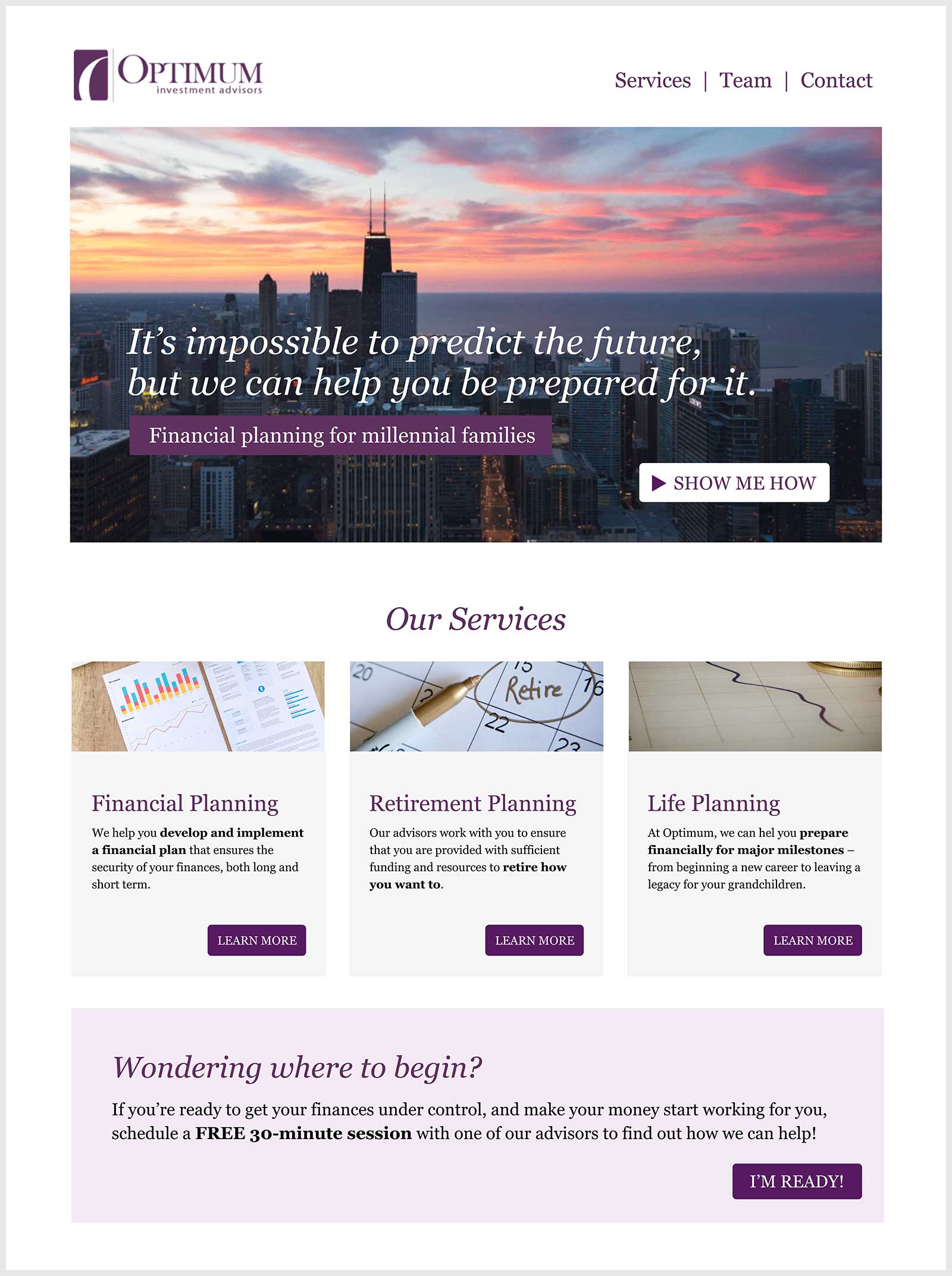
After the expert changes, the Optimum site has a clear visual hierarchy, I can easily tell at a glance what they do and who they help, and the links and navigation are obvious. THIS is the difference an expert can make!